
The 8 Best Paint Colors for Offices in Colorado
The color of your office walls does more than just fill the space; it also affects your mood, concentration, and creativity in a very direct way. Selecting the appropriate paint and local professional painting services is basically an entrepreneurial move, which can influence employees’ health and even the profit margin. What suits a beachside tech company may not endure the distinctive demands of a Colorado office, where strong, high-altitude sunlight can significantly change the appearance and effect of a color during the day. This is a pivotal point that is usually ignored in standard color guides.
This article dissects the science and psychology of the best office paint colors and even covers specific, actionable, productivity-based palettes to the letter. It doesn’t matter whether you work in a downtown Denver high-rise or a sun-drenched Westminster home office; we’ll show you how to choose a color that goes well with, not against, our local lighting conditions.
We’ll talk about how to use color to make a place that encourages creativity, helps one to concentrate, and is just right in terms of feeling. However, a comprehensive approach to your work area can increase efficiency even more.
Feel free to use these new office interior design ideas for a fresh look that will be a perfect complement to your new color scheme for further inspiration. Let’s ditch the dull beige and discover a hue that really energizes your work power.
1. Soft Blue for Focus & Productivity
Soft, muted blue shades have always been the go-to office paint colors, and color psychology explains why. Colors such as sky blue, powder blue, or subtle slate blue have a soothing, calming effect on the viewer. This peaceful feeling hence results in creating a more focused, productive work environment by cutting down on stress and mental disarray.

Unlike stimulating colors like red or orange, blue has a lower wavelength that is less taxing on the eyes, which helps sustain concentration over long periods. This is why major tech companies like Google and Facebook often integrate soft blues into their “focus zones” and collaborative spaces. The color supports cognitive tasks, quiet contemplation, and detail-oriented work, making it a powerful tool for enhancing employee output.
How to Implement Soft Blue in Your Office
To make this color work effectively, consider its application and pairings. An all-blue office, especially in a low-light area, can feel cold or somber.
- Create Balance with Warmth: Pair soft blue walls with warm wood tones in furniture, flooring, or shelving. Accent colors like a muted terracotta, warm gray, or even a pop of mustard yellow in decor can add warmth and prevent the space from feeling sterile.
- Leverage Natural Light: Blue truly shines in spaces with ample natural light, like many offices in sunny Colorado. The sunlight enhances its calming properties and prevents it from looking too dark or dreary.
- Choose the Right Finish: Opt for a matte or eggshell finish to minimize glare from overhead lighting and computer screens. This simple choice significantly reduces eye strain and supports a comfortable working environment.
Key Insight: Soft blue is ideal for individual workstations, quiet rooms, and any area where deep concentration is the primary goal. It helps create a mental sanctuary dedicated to task-oriented activities.
Selecting a color that matches well with the current design of your office and making a good choice in terms of shade is not an easy task. If you want to get professional advice about which color will be the most suitable for your lighting and other requirements, get a consultation. Knowing the details of choosing colors is really important, and to help you start, we have an interior paint consultation guide for use.
2. Warm Gray for Sophistication & Neutrality
Warm gray is a wonderful color to use in an office setting where you want the space to feel both professional and welcoming. Greige (which is a mixture of gray and beige) or soft taupe are examples of colors that can be used to create a chic, contemporary setting for work that encourages concentration yet they are not too cold or sterile. This adaptable neutral has gained status as a staple in the latest office interior design since it serves as a fresh backdrop that helps other design features, and above all, the work, to stand out.
In contrast to cool grays, which at times may look cold or factory-like, the gentle warmth in the contrast of greige provides a friendly, reassuring vibe. It is a color that represents harmony and control, hence, it is among the most suitable paint colors for offices where teamwork and a calm professional attitude are emphasized. For this reason, you will encounter warm gray schemes in the corporate offices of leading companies which are Apple and Microsoft; it communicates an image of classic beauty and earnestness.
How to Implement Warm Gray in Your Office
To maximize the benefits of warm gray, it’s crucial to pair it with the right lighting and accents to avoid a monotonous feel.
- Introduce Natural Textures: Combine warm gray walls with natural wood elements in desks, flooring, or decorative trim. The organic warmth of the wood beautifully complements the gray, creating a rich, layered look.
- Add Pops of Color: Use colorful artwork, vibrant green plants, or a bold accent chair to add visual interest and energy. Greige is the perfect neutral to make these accent colors stand out without overwhelming the space.
- Ensure Excellent Lighting: Warm gray thrives in well-lit environments. In Colorado, offices with abundant natural light look bright and airy. In spaces with less sunlight, ensure you have high-quality layered lighting (ambient, task, and accent) to prevent the color from appearing dull.
- Select the Right Finish: An eggshell or satin finish offers a slight sheen that reflects a small amount of light, helping to brighten the room. This finish is also more durable and easier to clean than matte, making it a practical choice for high-traffic office areas.
Key Insight: Warm gray is the ultimate modern neutral, ideal for open-plan offices, conference rooms, and reception areas. It establishes a sophisticated and grounded atmosphere that feels both professional and comfortable.
3. Energetic Green for Health & Creativity
For workplaces that look to encourage innovation, balance, and well-being, the great choice is the new green colors. Colors such as sage, pistachio, or a mild forest green have a very strong connection with nature. Thus, they lower stress and mental exhaustion. It is quite well-known that green is the single most soothing color for the human eye. Therefore, a green environment allows for both creative thinking and problem-solving over a longer period without losing focus due to overstimulation.
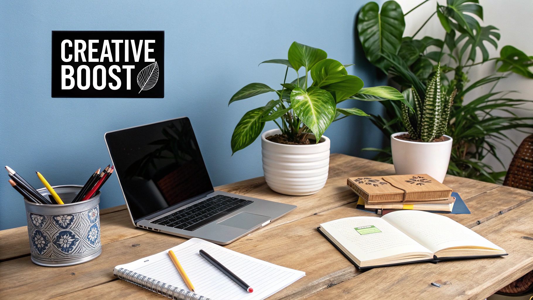
It is this restorative trait of the color that has led companies such as Airbnb to incorporate green in their brainstorming areas to generate new ideas. On the other hand, they are also used by medical institutions to establish a soothing environment for patients as well as medical staff. The color gives a feeling of balance and development, thus it is among the top paint colors for offices that aim at creativity and human comfort.
It freshens the brain, without the space becoming too energetic or overly vibrant. It keeps things down to earth and balanced.
How to Implement Energetic Green in Your Office
To maximize the benefits of green, it’s crucial to pair it with complementary elements and apply it strategically. An overly saturated or poorly lit green room can feel dated or overwhelming.
- Connect with Natural Elements: Amplify the biophilic effect by pairing green walls with natural wood tones in desks and shelving. Adding live plants is a fantastic way to double down on the connection to nature and enhance air quality.
- Balance with Neutral Tones: For a sophisticated, professional look, pair soft green walls with crisp white trim, light gray furniture, or charcoal accents. This prevents the color from dominating the space and keeps it feeling modern and clean.
- Use in a Satin or Eggshell Finish: A finish with a slight sheen, like satin or eggshell, reflects a bit of light, which helps the color feel fresh and vibrant, especially in collaborative areas. It’s also more durable and easier to clean than a matte finish.
Key Insight: Green is perfectly suited for creative departments, breakout rooms, wellness areas, and any space designed for collaboration and brainstorming. It helps generate a positive, forward-thinking energy.
Whether for a commercial office or a revitalized home workspace, the right shade of green can transform the atmosphere. If you’re considering a professional update, our interior residential painting services can ensure a flawless, lasting finish.
4. Warm White with Cream Undertones for Openness & Light
When it comes to the best office paint colors that will blend timelessness with a cozy atmosphere, warm white is a superb first pick. White shades that have hints of cream, beige, or ivory result in a space that is embraced, airy, and friendly, whereas cold, sterile whites are those which are not considered as welcoming.
Such colors are excellent at reflecting light, therefore, they can be your go-to solution when working with a small office, a common area, or a room that does not get much natural light. The soft warmth not only prevents the room from being too cold but also turns it into a perfectly neat, classy, and welcoming setting where both creativity and productivity can flourish.
Such companies as Apple prefer this style, their minimalist offices feature warm whites to create a spacious and tidy impression. In addition, in high-end corporate environments it is typical and shows professionalism without being too harsh.
Warm white’s flexibility makes it a perfect neutral background, so that corporate branding, art, and furniture may be the center of attention while still maintaining a bright and pleasant work atmosphere all day long.
How to Implement Warm White in Your Office
To use warm white effectively, the key is to build layers of texture and complementary tones to avoid a monotonous look.
- Pair with Natural Textures: Combine warm white walls with natural wood elements in desks, flooring, or decorative features. The organic feel of wood adds depth and visual interest, beautifully complementing the paint’s creamy undertones.
- Introduce Strategic Accent Colors: Use furniture, rugs, or artwork to introduce soft accent colors like sage green, dusty rose, or navy blue. This creates a more dynamic and personalized space while maintaining an overall sense of calm.
- Invest in Quality Paint and Lighting: Low-quality whites can yellow unevenly over time, especially in high-sun Colorado offices. Choose a high-quality, durable paint and pair it with layered lighting (ambient, task, and accent) to enhance the color’s inherent brightness and warmth day or night.
Key Insight: Warm white is perfect for creating a clean, modern, and spacious feel in any office. It serves as a versatile foundation that supports a range of design styles and enhances both natural and artificial light.
5. Soft Taupe for Balance Between Energy & Calm
If you’re looking for the best office paint colors, soft taupe is a classically chic neutral that elegantly combines the deep and stabilizing qualities of brown with the calm and peaceful nature of gray. Such a flexible color makes for a nicely even and friendly ambiance that is both work-like and home-like. The natural warmth of the color invites a feeling of being safe and of concentration, at the same time, its soft tone makes sure that the color does not turn into a source of distraction, thus, a quiet and productive atmosphere is achieved.
Instead of using harsh whites or grays which usually look cold, taupe gives a warm and earthy feeling that is in harmony with the timeless as well as the contemporary. These traits have made it a popular choice, among one hand, tech companies that are heavily into design and, on the other hand, corporate law firms where the efficient, refined image is highly valued. The color therefore helps to keep a calm yet alert mind, hence it is ideal for spaces which are used for both team work and solo focus.
How to Implement Soft Taupe in Your Office
To maximize the benefits of taupe, focus on creating depth and visual interest through strategic pairings and textures.
- Elevate with Accents: Pair taupe walls with rich, jewel-toned accents like emerald green, sapphire blue, or deep burgundy in chairs, artwork, or decor to create a luxurious and elegant feel. For a more modern look, pair it with crisp black-and-white elements.
- Embrace Texture: To prevent this neutral from appearing flat, introduce a range of textures. Think about a rough-hewn wooden conference table, plush velvet seating, or sleek metal light fixtures to add dimension and character to the space.
- Choose the Right Finish: An eggshell or satin finish is often ideal for taupe. It offers a subtle sheen that reflects a small amount of light, giving the walls a soft glow without the distracting glare of glossier paints, which is perfect for maintaining a comfortable working environment.
Key Insight: Soft taupe is a perfect choice for common areas, conference rooms, and private offices where a sense of grounded professionalism and quiet focus is desired. It’s a versatile foundation that adapts to nearly any decor style.
Exploring the right color combinations can transform your office from functional to inspirational. To see how taupe can be integrated with other colors, explore our guide to the best interior paint color combos for more ideas.
6. Soft Yellow for Optimism & Mental Stimulation
The bright yellow tones can be too much for the senses, but a gentle, muted yellow gives just the right combination of energy and warmth, therefore it is one of the best office colors. Different shades of butter yellow, soft gold or light champagne not only boost mental activity and generate a spirit of optimism but also contribute to making a place friendly without causing any kind of annoyance. This low level of energy is ideal for activating brain functions and encouraging happy social interaction.
This color is associated with feelings of happiness and innovation, which is why it is a favorite in creative and collaborative environments. Companies such as Google frequently use gentle yellows in their break rooms and social areas to promote informal brainstorming and team bonding. In the same way, creative agencies discover that a light yellow highlight in a meeting room can stimulate fresh ideas and maintain high energy levels during long sessions.
How to Implement Soft Yellow in Your Office
The key to using yellow effectively is subtlety and balance. A full-on yellow office can be overwhelming, but when used strategically, it can transform a space.
- Use it as an Accent: Apply soft yellow to an accent wall in a meeting room, brainstorming area, or common space, rather than painting the entire office. This provides a boost of energy without overwhelming the senses.
- Pair with Calming Neutrals: To create a sophisticated and balanced look, pair soft yellow with cool grays, crisp whites, or even deep charcoal. This allows the yellow to stand out as a cheerful focal point without dominating the room.
- Enhance with Natural Light: Like many colors, pale yellow looks best in well-lit spaces. In sunny Colorado offices, natural light will bring out its warmth and prevent it from appearing dull or muted. For rooms with less light, ensure your artificial lighting is bright and clean.
Key Insight: Soft yellow is the perfect choice for collaborative zones, break rooms, and any area that encourages creativity, social interaction, and a positive mindset. It energizes without distracting.
Figuring out which yellow shade is cheerful and not too bright is not an easy task. If you are unsure about which color to choose that will go nicely with your office lighting and function, you may get a professional consultation that will clarify your mind. The I PAINT STUFF crew will help you to find the right palette for a workspace that is both productive and happy.
7. Muted Terracotta for Warmth & Grounding
For offices seeking to cultivate a welcoming and stable environment, muted terracotta and soft rust tones offer a sophisticated alternative to traditional neutrals. These earthy hues are connected to feelings of security, comfort, and confidence. By introducing this organic warmth, you can create a grounding atmosphere that helps employees feel more connected and secure, fostering a sense of community and collaborative spirit.
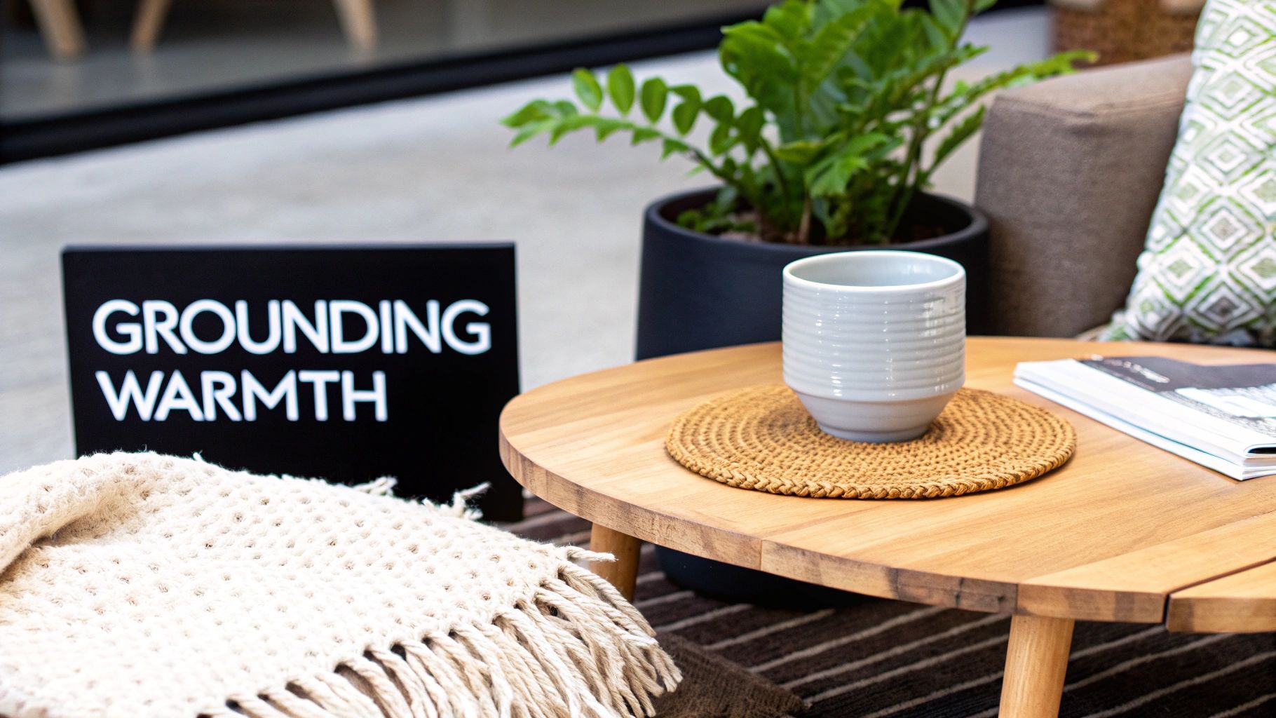
While brighter oranges are vibrant, muted terracotta has a depth of warmth and gentleness, which brings character without catching too much attention. It is among the most beautiful hues suitable for offices that aspire to foster a tight, supportive culture. This shade is used in creative agencies like design studios to spark creativity, as well as in the executive offices of financial institutions to communicate trust and confidence.
How to Implement Muted Terracotta in Your Office
The richness of terracotta requires a balanced approach to prevent it from overwhelming a space. Proper application is key to unlocking its grounding benefits.
- Use as an Accent: Terracotta works exceptionally well as an accent wall, particularly in common areas, reception lounges, or conference rooms. This adds depth and character without making the entire office feel dark or small.
- Pair with Natural Elements: Complement terracotta walls with warm wood tones, leather furniture, and live plants. These natural materials enhance its earthy feel and create a cohesive, organic design. Combine it with a crisp white or a warm cream on other walls for a clean, professional balance.
- Consider the Light: This palette thrives in spaces with abundant warm, natural light, which is common in many Colorado offices. The sunlight brings out the color’s inherent warmth, preventing it from appearing too flat or dull.
Key Insight: Muted terracotta is perfect for creating a welcoming first impression in entryways or fostering a sense of belonging and stability in collaborative zones and break rooms.
e
It may be difficult to find a shade of terracotta that matches the lighting and furniture in your office. That’s why a color consultant can be a great help in making sure you choose a warm and comforting color shade without overwhelming the workspace. Our guide for interior paint consultation will help you decide the perfect one.
8. Cool Lavender for Creativity & Calm Focus
In fact, cool lavender runs lullabies about comfort and styles others: So it is a pretty chic choice to indicate the perfect creativity and calmness. Light purple colors and faded purple shades foster creativity and open-mindedness, but at the same time, they don’t give such an energetic push as warm colors. This very balance makes it one of the most suitable choices for painting studios or majorly decorated rooms with color themes focused on innovative ideas and artistic works.
The psychology of lavender links the color to qualities such as wisdom, luxury, and originality. In an office setting, the color makes one feel that their work has meaning, encourages fresh ideas, and still keeps a calm and concentrated vibe. Therefore, it is very understandable that creative agencies, design firms, and innovation hubs are making use of such colors to come up with spaces that are not only aesthetically pleasing but also professional in nature.
How to Implement Cool Lavender in Your Office
The key to using lavender successfully is subtlety and strategic pairing. A vibrant purple can be overwhelming, but a muted, cool-toned shade can elevate a space.
- Choose Muted Shades: Stick to pale, grayed-out lavenders for a professional feel. Avoid anything overly saturated or bright, as it can feel juvenile and distracting in a corporate setting.
- Pair with Modern Neutrals: Balance lavender walls with crisp whites, cool grays, or charcoals in furniture and flooring. This modern palette keeps the look grounded and sophisticated.
- Add Metallic Accents: Elevate the space by incorporating brass or gold accents in light fixtures, hardware, or decorative items. These warm metals provide a stunning contrast against the cool purple tones.
- Use as an Accent: If an all-lavender room feels too bold, use it on a single accent wall in a brainstorming room, lounge area, or creative department to define the zone’s purpose.
Key Insight: Cool lavender is perfect for design studios, marketing departments, and innovation labs where a blend of calm focus and creative energy is essential for success.
Selecting the perfect shade of lavender is very important if you want to get a look that is professional and inspiring. In case you are unsure of how to pick a smart color that is compatible with your office light and the character of your brand, we at I PAINT STUFF can help you through our color consulting services.
8-Color Office Paint Comparison: Mood & Benefits
Color Option | Implementation Complexity | Resource Requirements | Expected Outcomes | Ideal Use Cases | Key Advantages & Tips |
Soft Blue for Focus & Productivity | Low — straightforward application; avoid overly dark shades | Low — standard paint; matte finish; good natural light | Improved concentration (~+15%); reduced stress and physiological calm | Individual workstations, focus zones, quiet offices | Calming & professional; pair with warm accents to prevent coldness |
Warm Gray for Sophistication & Neutrality | Low–Medium — select correct warm undertone to avoid dinginess | Low — standard paint; add artwork or wood elements for interest | Neutral, timeless backdrop; hides minor imperfections | Meeting rooms, corporate offices, open-plan spaces | Highly versatile; add plants/art and warm materials for balance |
Energetic Green for Health & Creativity | Medium — balance hue to avoid yellow/blue bias | Medium — quality paint plus biophilic elements (plants, wood) | ↑ Creativity and well‑being; reduced mental fatigue | Creative teams, collaborative areas, wellness zones | Biophilic boost; combine with real greenery and natural materials |
Warm White with Cream Undertones for Openness & Light | Low — simple application but pick high-quality, non-yellowing paint | Low–Medium — better lighting and higher-quality finishes recommended | Makes spaces feel larger/brighter; clean, professional look | Small offices, reception areas, multipurpose rooms | Maximizes light; use semi-gloss/satin for easier cleaning and maintenance |
Soft Taupe for Balance Between Energy & Calm | Medium — careful undertone selection to avoid dated appearance | Low–Medium — paint plus complementary accents and textures | Balanced, sophisticated environment; promotes comfort and focus | Hybrid workspaces, executive offices, client-facing rooms | Flattering neutral; add jewel tones or textures to prevent flatness |
Soft Yellow for Optimism & Mental Stimulation | Low–Medium — use muted tones only to avoid overstimulation | Low — best as accents; ensure ample natural light | ↑ Mood and alertness; encourages communication when used sparingly | Meeting rooms, break areas, brainstorming zones | Boosts optimism; apply as accent walls or panels, pair with neutrals |
Muted Terracotta for Warmth & Grounding | Medium — best applied as accents to avoid overwhelming a space | Medium — pairs well with natural materials and warm lighting | Creates inviting, grounded atmosphere; adds personality | Meeting nooks, design studios, executive suites | Adds character and warmth; balance with creams/wood to prevent muddiness |
Cool Lavender for Creativity & Calm Focus | Medium — choose pale, muted shades to stay professional | Low–Medium — accent decor and neutral pairings recommended | Stimulates creativity while reducing anxiety; memorable aesthetic | Innovation labs, creative teams, design agencies | Unique yet calming; balance with grays/whites and metallic accents for sophistication |
Bring Your Perfect Office Palette to Life with Professional Precision
Picking the best paint colors for an office is not just about making the space look good; it is a strategy that helps increase employees’ productivity, creativity, and well-being. We are aware that the perfect color can change a simple room into a space that has been designed for success. Such colors as the calm and focused Soft Blue or the Energetic Green that stimulates one’s creativity, are each giving their psychological effect and practical benefit. What is most important is that your office walls can do a lot of good to the employees’ mood and level of concentration as well as to making your company’s brand more recognizable.
Mastering this concept means that you no longer pick colors in a random way, but you choose a color palette that is purposely aligned with your team’s objectives and the actual conditions of your space. Think about what your work requires most: is your team mainly doing deep concentration work or is it collaborative brainstorming? Such a decision will lead you to colors like Soft Taupe for harmony or Soft Yellow for cheerful energy.
Beyond the Color Swatch: Execution is Everything
The transition from a paint chip to a finished wall is where vision becomes reality, and this step is filled with critical details. The amount of natural light your office receives, especially under the intense Colorado sun, can dramatically alter how a color appears. A warm gray that looks perfect in a showroom might appear flat or dingy without sufficient lighting. To maximize the impact of your chosen palette, you must ensure your space is as bright as possible. For instance, investing in professional Denver window cleaning services can significantly increase the natural light in your office, allowing the true tones and undertones of your new paint to shine through.
Moreover, paint finish and surface prep are two of the most important factors that determine the success of a project. A satin or eggshell finish provides both resistance and a slight sheen, which is a perfect combination for the areas where people walk a lot. On the other hand, a matte finish gives a chic and non-reflective appearance, which is just right for accent walls. The proper prep work such as patching holes and priming surfaces will lead to a final coat that is flawless, homogeneous, and has good adhesion, thus, it will not peel or fade in the future. In the end, it is through the application of these methods that a simple office design is elevated and transformed into a great one that is visually stunning and at the same time a great space for working.
Ready to transform your vision into a stunning and productive workspace? The expert team of exterior and interior painters nearby at I PAINT STUFF provides professional color consultation and flawless execution for commercial and home offices across Westminster, Arvada, and the greater Denver area. Contact us today for a free, no-obligation estimate, and let’s create an office that inspires.
Frequently Asked Questions
What paint colors work best for offices in Colorado?
In Colorado, corporate paint colors that harmonize with both the natural light and outdoor scenery, normally are the ones that work best. Soft blues, warm grays, earthy greens, muted taupes, and creamy whites are particularly trendy as they depict the state’s mountain scenery, vast skies, and nature’s elements.
Are neutral colors better for professional office spaces?
A pretty safe and professional option are neutrals, indeed. Greige, soft beige, warm gray, and off-white tones serve as a clean, timeless background that is especially suitable for offices where clients are received. However, you may bring in the character through the use of an accent wall, painting, or décor.
What paint finish is best for an office?
For most offices:
- Eggshell or satin finishes are ideal for walls because they’re durable and easy to clean.
- Semi-gloss works well for trim and doors.
- Matte finishes can look modern but may show scuffs more easily in high-traffic areas.
How can I make a small office look bigger with paint?
Light paint colors like cream, light gray, or fresh sky blue give an illusion of spaciousness to a small office. On top of that, if the trim is painted in the same color as the walls (or even slightly lighter), it will also add to the airy vibe.
Are earth tones popular in Colorado offices?
Absolutely. Earth-inspired tones such as clay, sage, warm sand, and muted brown reflect Colorado’s natural landscape and create a grounded, welcoming atmosphere, especially in mountain or foothill communities.
How do I test paint colors before committing?
Always test large sample swatches (at least 12” x 12”) on multiple walls. Observe them in:
- Morning light
- Midday sun
- Evening light
- Artificial lighting
Colorado’s bright sunlight can dramatically change how a color looks.
Should office paint colors match my brand?
Yes. If your office welcomes clients, aligning paint colors with your brand palette can reinforce professionalism and identity. Just be sure to soften very bold brand colors so the space remains comfortable and productive.